 View full size ↗
The everyday problem
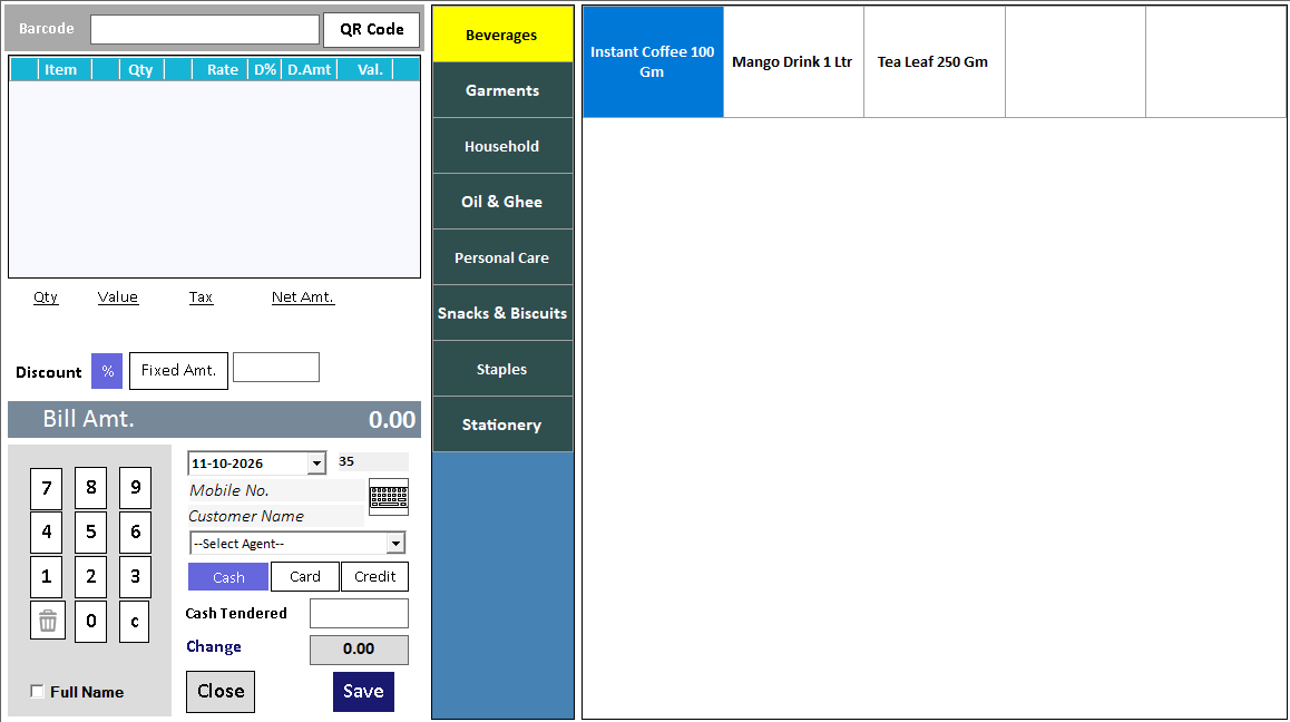
A touch screen works best when the cashier can see the basket, change quantities and find common actions without hunting through the interface. Judge the layout from the position where staff actually stand, with the printer, scanner and payment equipment in place.
A workable process
Use a representative basket rather than a single easy item. Ask a cashier to add products, change one quantity and review the total. Note every moment they reach for the keyboard or ask where an action is located. Compare this with the regular POS workflow using the same basket.
A practical example
For a bakery, a mixed order may include loose pieces, a packaged product and two varieties with similar names. A large product button is helpful only if its label lets staff choose the correct variety. Test names and units alongside the touch targets.
Before you finish
Check visibility, common-item lookup, correction steps and final receipt. Choose the workflow your staff can repeat accurately; the touchscreen alone does not determine checkout speed.
Try this check with your team
Place the actual device where the cashier will stand. Select frequent items, change a quantity, review the basket and find the payment action. Repeat with a less familiar staff member and a product with a similar name.
What the result tells you
The layout is useful when the task remains clear at working distance. Review button size, grouping and labels before expanding the catalogue; a touch-capable screen alone does not guarantee an efficient counter.
See this workflow in Speed Plus.
Bring a sample transaction and your questions to a product demo.
Book a free demo ↗